
 by
by A lament by an art director in B2B Tech marketing.
B2B companies love taking risks.
They’ll invest millions in R&D. They’ll experiment with emerging technologies. They’ll build AI solutions nobody thought were possible a few years ago. They’ll proudly talk about disruption, innovation, transformation, and changing the future.
But when it comes to branding and marketing?
Suddenly everyone wants to play it safe.
The logo needs to feel familiar. The visual language needs to look like the category. The campaign shouldn’t be too different. The ad shouldn’t be too bold. The design shouldn’t make anyone uncomfortable.
The irony is hard to miss. Companies building cutting-edge technology often communicate it using the same visual language that everyone else in the category is using.
And that’s exactly why so much B2B marketing feels interchangeable.
If you removed the logo from many B2B campaigns today, chances are you’d struggle to identify the brand behind them.
It is not a Creativity Problem!
For most Designers working on B2B brands, solving incredibly complex communication challenges is the major chunk of the work. They are working with technical products (which sometimes feels like an alien language, pff, I know), tight deadlines, legal approvals, brand guidelines, etc. In such scenarios the safest ideas win over the boldest ones, and over time they become the industry norm.
The result is an industry filled with safe logos, safe colour palettes, safe imagery, and safe messaging.
Of course, there are exceptions.
We’re starting to see some brands challenge the traditional “corporate technology” aesthetic. Some are introducing stronger personalities, bolder visual systems, more distinctive typography, and less predictable storytelling.
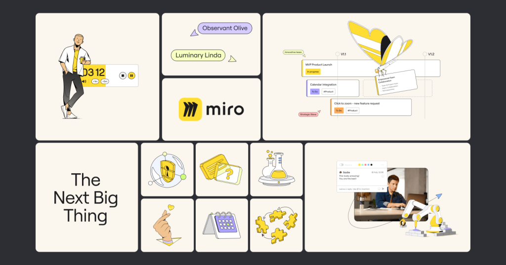
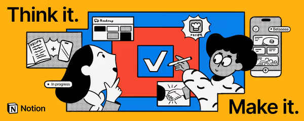
And they stand out immediately.
Not because they’re louder.
Because they’re different.
In a category where everyone is claiming to be innovative, looking different has become one of the most effective ways to prove it.
Why does everything look the same?
The first reason starts with the trend to imitate what the market leader is doing. When a market leader adopts a particular visual style, competitors naturally follow. Soon, every AI company uses glowing neural networks, every cloud platform shows floating data streams, and every enterprise software ad features a sleek dashboard.
Difficulty in visualizing many B2B products is another reason. How do you visualize cloud infrastructure? What is the visual that came to your mind when you thought about it? The one you have seen on every ad, right? The cloud above the servers? Designers often use familiar visual shortcuts because they’re universally understood, even if they’ve become overused.
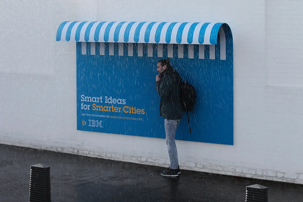
Then there’s the tendency to communicate too much at once. Features, benefits, statistics, certifications, awards, testimonials, and CTA all compete for attention within a single creative. Instead of making one strong point, the design tries to say everything and ends up saying very little.
Today, almost every company claims to have an AI solution. Every company claims to increase efficiency. Every company claims to improve productivity. When product messaging starts sounding similar, brand becomes the differentiator. Yet many companies continue treating brand as decoration rather than strategy.
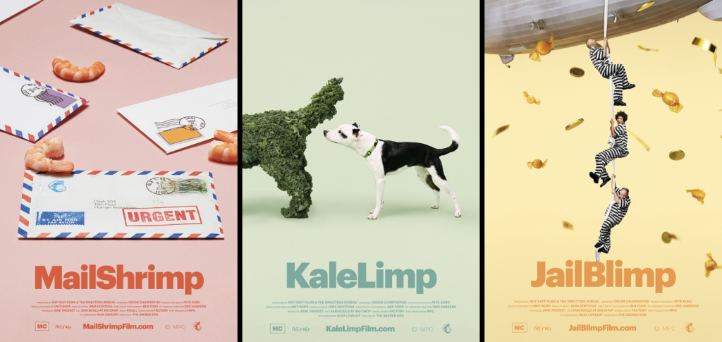
A strong brand isn’t just a logo or a colour palette. It’s a distinctive way of showing up in the market. Often, that distinction comes from small, consistent design decisions rather than a complete rebrand. Typography, illustration style, motion, image treatment, or even layout principles can become powerful brand assets over time. It’s the visual language, the tone of voice, the storytelling approach, the design system, and the creative decisions that make people recognise you before they see your logo.
In a market filled with similar products and similar promises, distinctiveness becomes incredibly valuable. And design plays a huge role in creating that distinctiveness.
How can Designers break the Pattern?
Lets not think about something unnecessarily loud or complicated, let’s start by asking ourselves a simple question:
“Could this ad belong to one of our competitors?”
If the answer is yes, there’s an opportunity to rethink the creative direction.
Challenge the visual shortcuts. Question whether the design choice is helping the audience understand the message or simply following an established pattern.
Think about the brand before thinking about the category. Before reaching for familiar industry references, ask what visual cues genuinely belong to the brand. The goal isn’t to look different for the sake of it, but to create something that feels recognisably yours. Look for ideas, metaphors, and stories that are unique to the business rather than unique to the industry. Simplify the message. Remove unnecessary elements. Design around the customer’s experience instead of the product’s technical specifications.

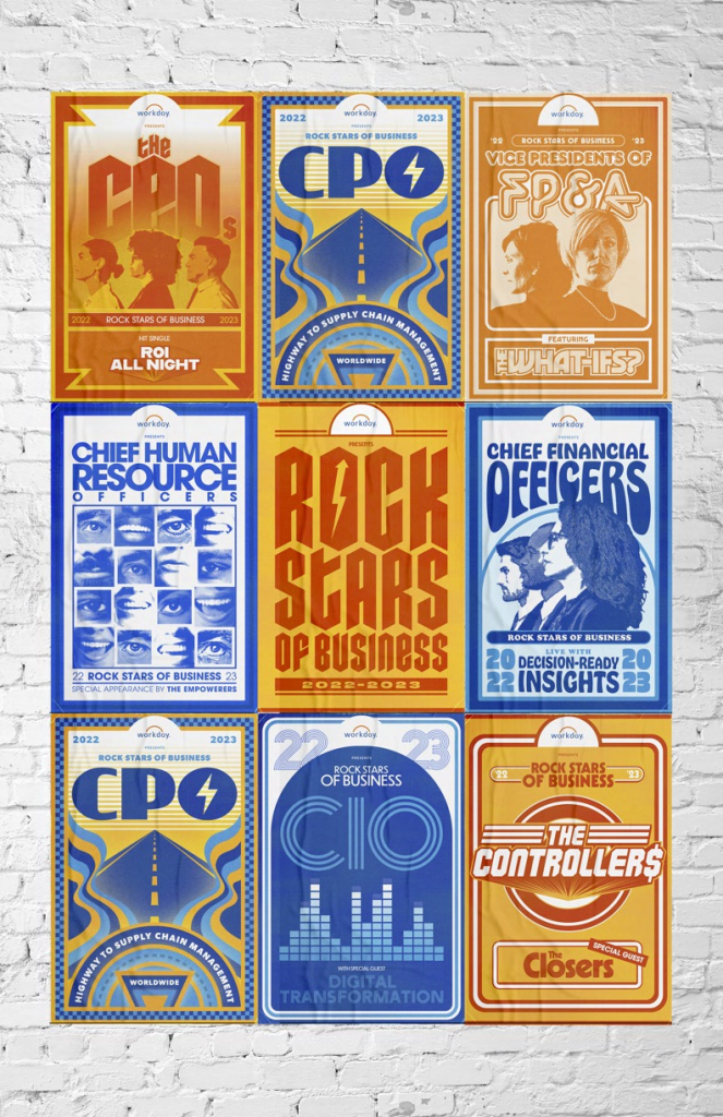

Sometimes the most effective and memorable design is the one with the clearest idea, not the one with the universally understood visual.
Thinking Differently!
In B2B marketing, differentiation isn’t only about having a better product. It’s also about communicating differently.
When every brand looks the same, originality becomes a competitive advantage.
As designers, our job isn’t simply to make information look attractive. It’s to transform complexity into clarity, strategy into storytelling, and products into ideas people remember.
Because to the audience who is constantly fed the same information, the same visual; being similar to the competitor is the biggest risk. By doing so you are becoming invisible.
Let’s create unforgettable ads.