
 by
by A great design doesn’t make people look everywhere.
It tells them exactly where to look first.
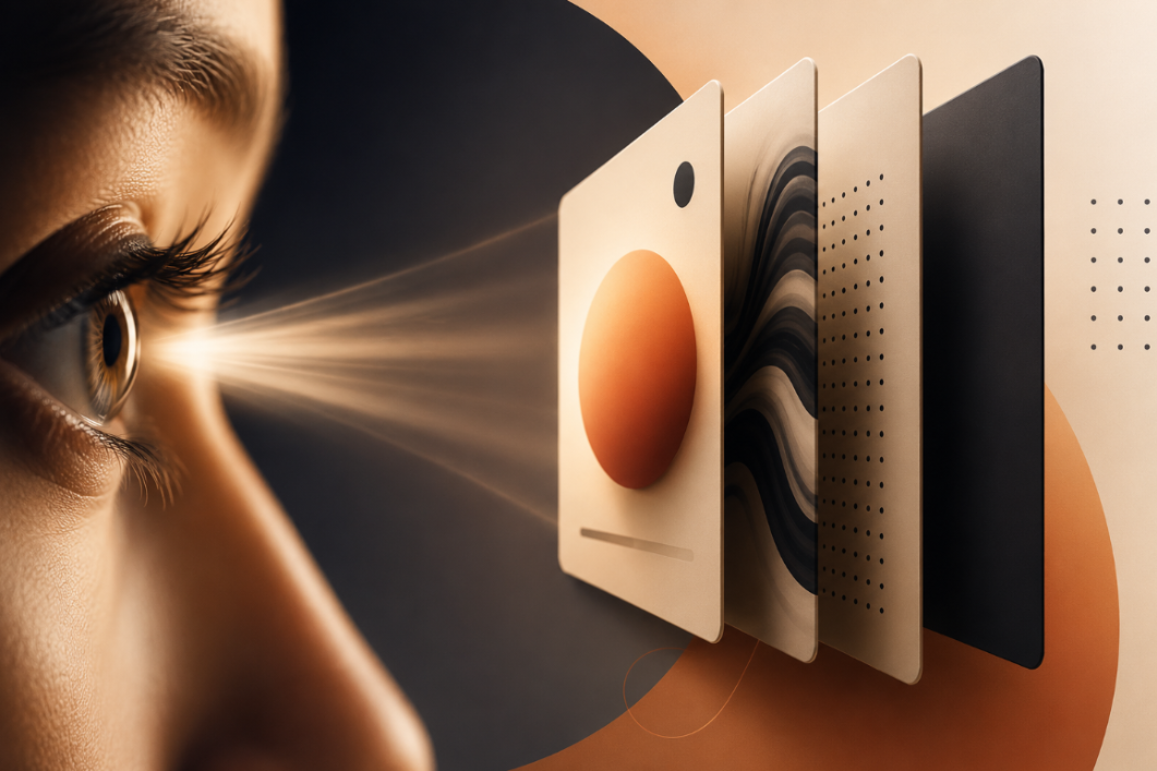
In a world of endless scrolling, crowded interfaces, and competing messages, the first few seconds of attention are critical. Visual hierarchy is the invisible system that decides what gets noticed first, what gets understood next, and what gets ignored.
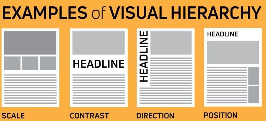
The First 3 Seconds
When someone encounters a design, they rarely read everything from top to bottom.
They scan.
Their attention is pulled toward elements that have stronger visual signals — size, contrast, position, color, typography, and whitespace. Good hierarchy turns that split-second scan into a deliberate journey.
Think of it as:
- What should I notice?
- What does it mean?
- What should I do next?
If your design can’t answer those questions quickly, the problem may not be the content.
It may be the hierarchy.
01: Size Says: “Look Here.”
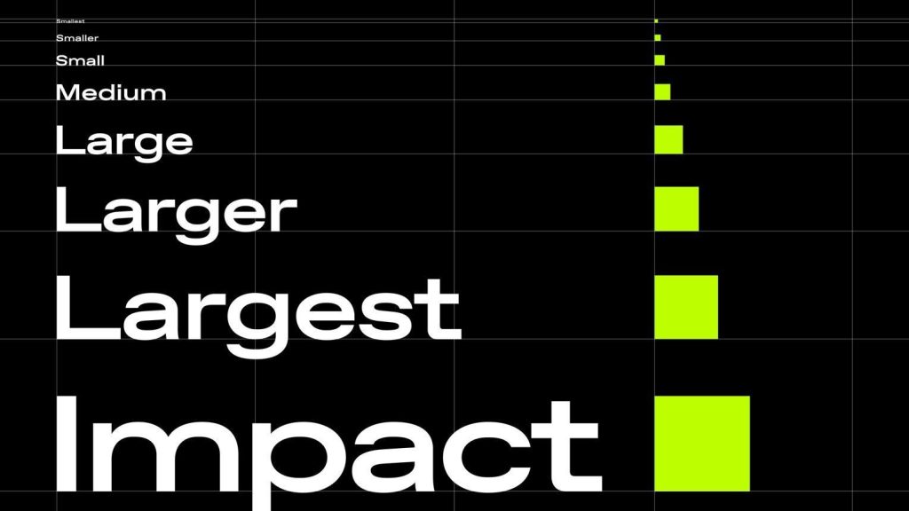
Size is one of the fastest ways to establish importance.
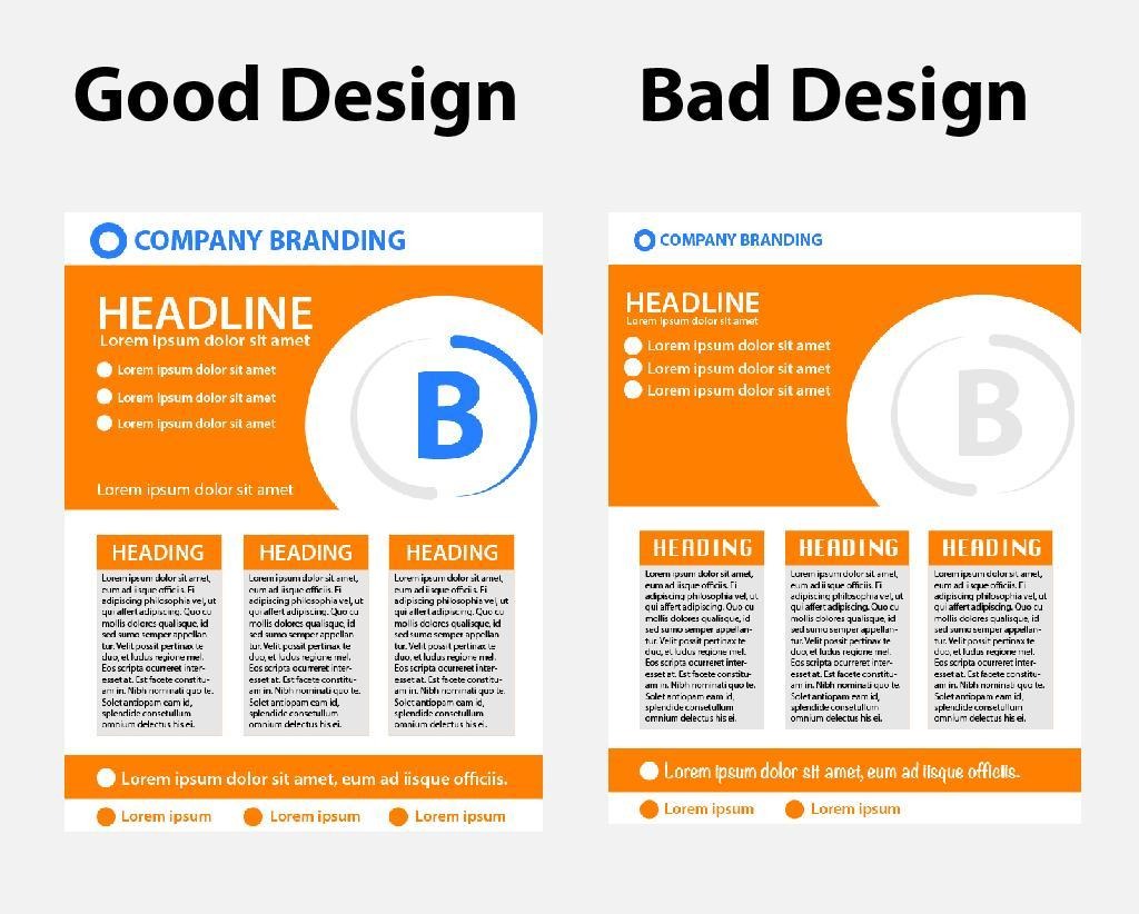
A large headline naturally dominates a smaller supporting line. But hierarchy isn’t simply about making everything bigger.
It’s about creating meaningful differences in scale.
For example:
DON’T DESIGN EVERYTHING BIG.
Instead:
ONE BIG IDEA
Supporting thought
Small supporting details
The viewer immediately understands the order of importance.
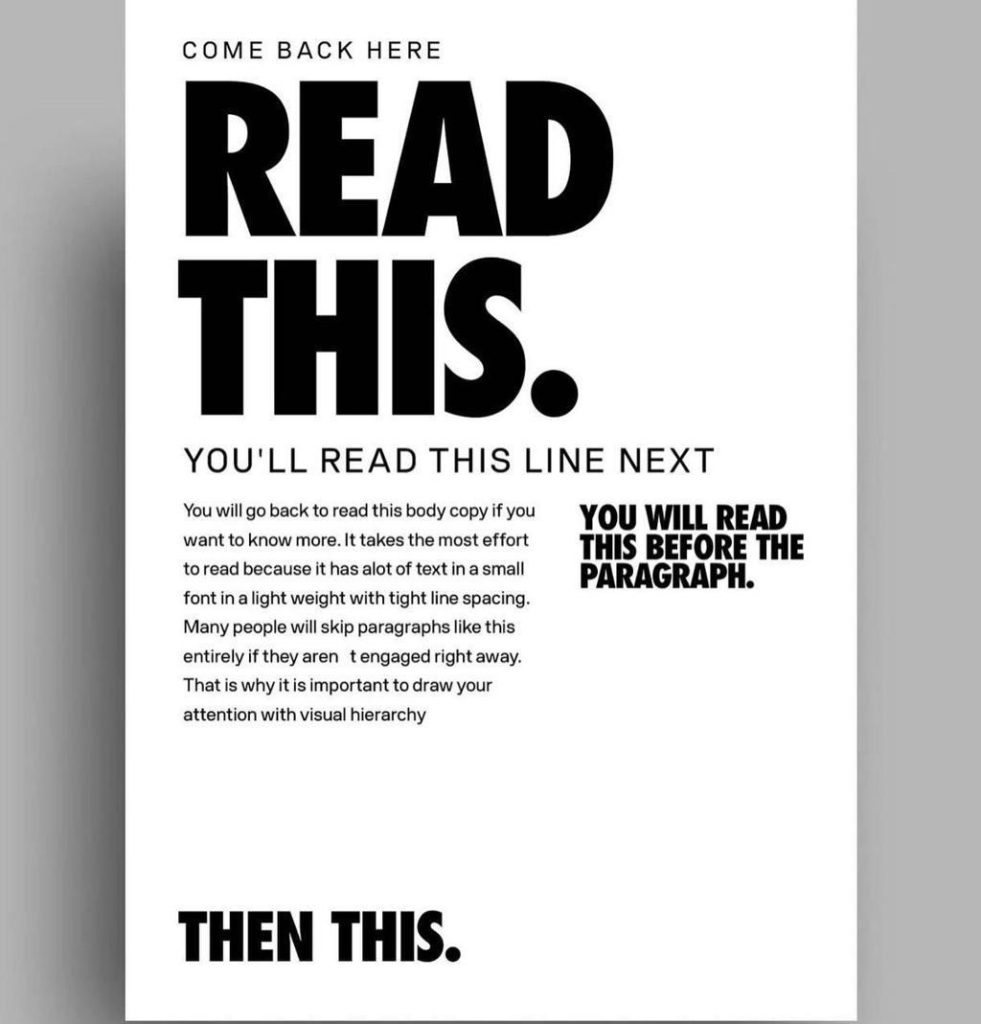
Designer takeaway:
If everything is large, bold and loud, nothing is actually dominant.
02 — Contrast Creates the Focal Point
Contrast is attention’s spotlight.
It can come from:
- Light vs dark
- Large vs small
- Bold vs light
- Bright vs muted
- Sharp vs soft
- Dense vs empty
A single high-contrast element can immediately become the focal point of a composition.
Imagine a mostly monochrome poster with one electric-blue word.
Your eye doesn’t need instructions.
It goes there.
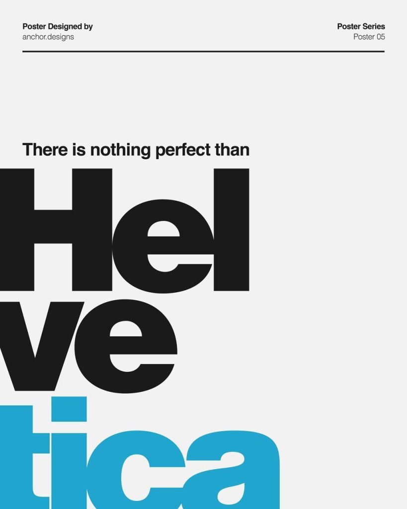
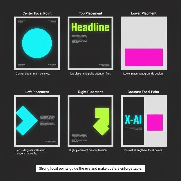
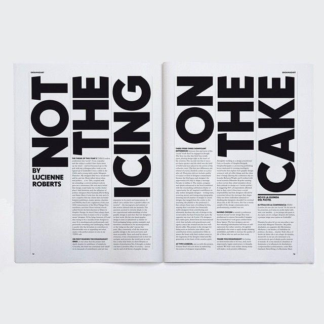
The lesson:
Don’t add contrast everywhere.
Save it for what matters.
03 — Whitespace Gives Attention Room
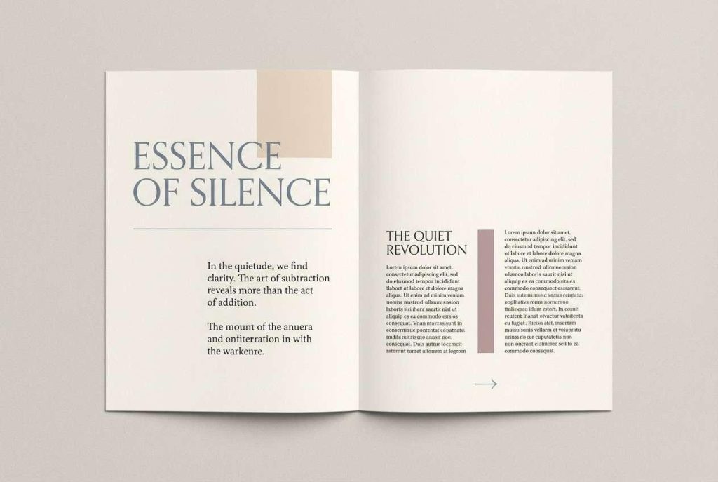
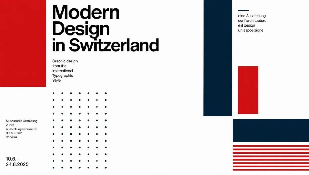
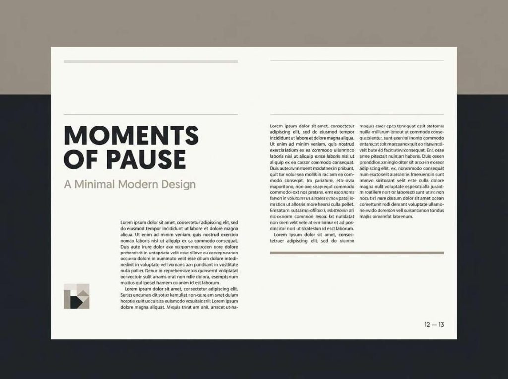
Whitespace isn’t wasted space.
It’s attention space.
When an important element has room around it, it becomes easier to notice. Crowding, on the other hand, makes multiple elements compete simultaneously.
Think of whitespace as the pause between sentences.
Without the pause, everything becomes noise.
With it, the important message gets room to breathe.
5
Try this:
Take your next design and remove 20% of the elements.
You may discover that the design becomes stronger — not emptier.
04 — Position Controls the Journey
Where something sits matters.
A headline placed at the top of a composition immediately establishes an entry point. A CTA positioned after the main message creates a natural next step.
Designers can use alignment and familiar scanning patterns to create an intentional path through information. Common patterns include Z-pattern and F-pattern scanning, particularly in digital interfaces.
Think:
START → UNDERSTAND → EXPLORE → ACT
Your layout should make that journey feel effortless.
05 — Typography Has a Voice
Typography doesn’t just communicate words.
It communicates importance.
Compare:
THE NEW COLLECTION
with
the new collection
Same words.
Completely different priority.
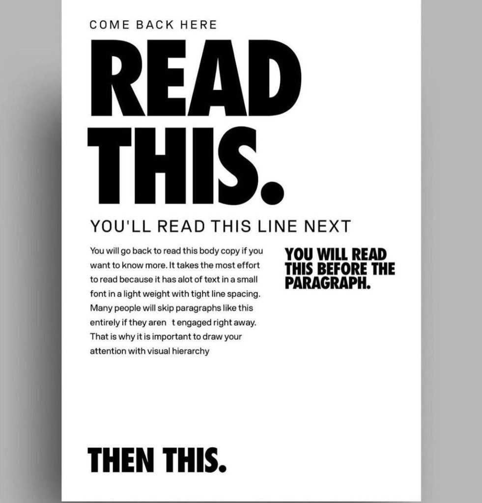
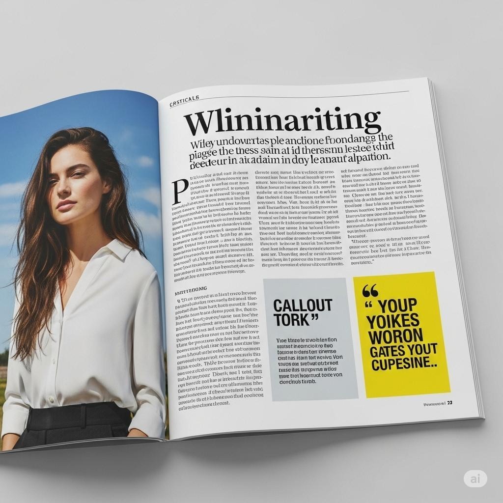
Weight, scale, spacing, case, and typeface can establish levels of information before someone consciously reads the content.
A useful hierarchy might look like:
LEVEL 01
Headline
LEVEL 02
Supporting statement
LEVEL 03
Body copy
LEVEL 04
Metadata / details
If every level looks identical, the viewer has to work harder.
06 — Don’t Give Everything Equal Importance
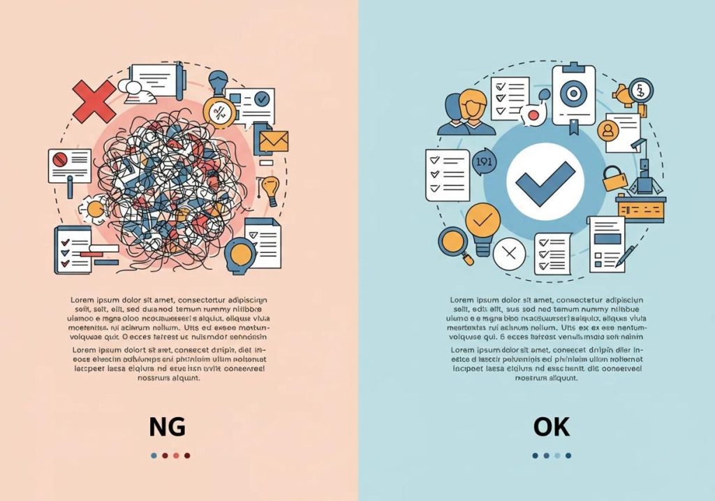
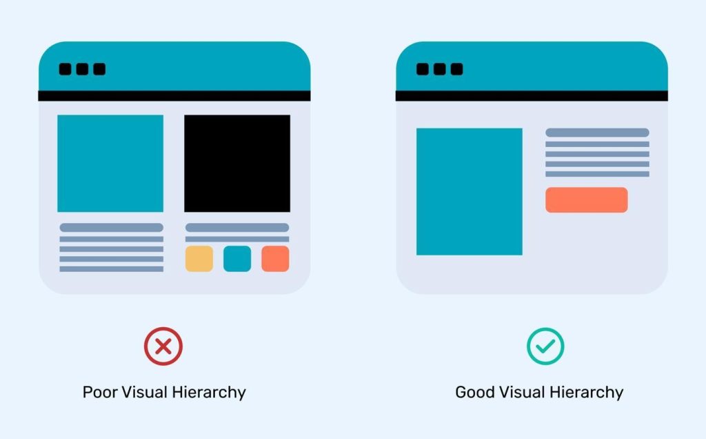
One of the biggest hierarchy mistakes is trying to make everything important.
Five headlines.
Three CTAs.
Four bold statements.
Multiple colors.
Multiple focal points.
The result?
Visual competition.
A strong layout usually has a clear winner.
Primary → Secondary → Supporting
The primary element grabs attention.
The secondary element explains.
The supporting elements complete the story.
8
The 3-Second Test
Here’s a simple test every designer can use.
STEP 01
Show your design to someone for 3 seconds.
STEP 02
Hide it.
STEP 03
Ask:
“What did you see first?”
Then:
“What was the message?”
Then:
“What do you remember?”
If their answer matches your intention, the hierarchy is working.
If they remember the logo, an image, or an insignificant detail instead of the main message—
your hierarchy needs work.
A similar practical test is to reduce a design to grayscale and check whether the hierarchy still holds without relying entirely on color.
The Designer’s Hierarchy Checklist
Before you ship a design, ask:
01 — FOCUS
What should people see first?
02 — FLOW
Where should their eyes go next?
03 — CLARITY
Can they understand the message quickly?
04 — CONTRAST
Is the most important element visually dominant?
05 — SPACE
Does the key message have enough breathing room?
06 — ACTION
Is the next step obvious?
The Real Secret
Visual hierarchy isn’t about making a design louder.
It’s about making the right thing louder.
Because attention is limited.
And when everything competes for it, nothing wins.
The best designers don’t just create beautiful compositions.
They choreograph attention.
So before asking:
“Does this look good?”
Ask something more important:
“What will they see in the first three seconds?”
Because those three seconds can decide whether they keep looking — or move on.
Design the first glance.
The rest follows.