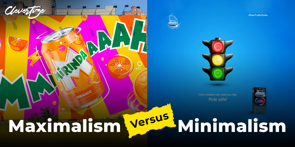
Welcome, my fellow marketing enthusiasts, to a delightful exploration of the two contrasting worlds of advertising—minimalism and maximalism. In this blog, we’ll unravel the battle of these creative styles. So, fasten your seatbelts, grab a cup of coffee or masala chai and let’s dive into the captivating realm of advertising aesthetics!
The Minimalism Magic:
Picture this: a sleek white backdrop, a single striking image and a concise tagline that hits you like a lightning bolt. That, my friends, is the power of minimalistic advertising. These ads are the epitome of elegance and simplicity, delivering their message with surgical precision. They are like the cool, calm and collected individuals who speak volumes with just a few carefully chosen words.



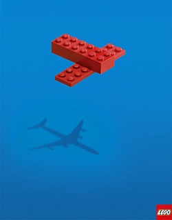
Minimalism is clean, focused and gets straight to the point. But sometimes, it feels like they are trying to sell us air. The lack of excitement? The pizzazz? The concept of minimalism fails if you want an ad that feels like a party.
The Maximalism Mayhem:
Enter the maximalists, the rebels of the advertising world. These folks believe in bombarding you with a kaleidoscope of colours, symphony of sounds and whirlwind of imagery. Their ads are like a vivid dreamscape, where every second is filled with eye-catching visuals and memorable catchphrases. It’s like a fireworks show on steroids!
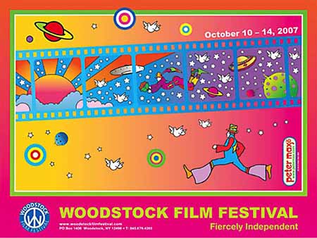
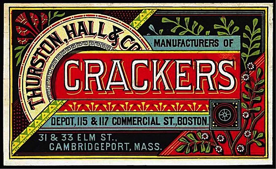
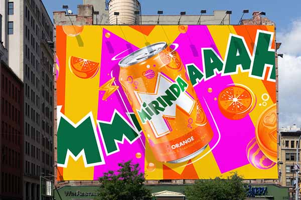

Oh, how the maximalists bring joy and excitement to the advertising arena! They create ads that are as loud as a rock concert and as flamboyant as a Broadway musical. But let’s not forget that sometimes their ads can feel like an overwhelming sensory explosion. It’s like they’re playing all the instruments in the orchestra at once and my poor brain can’t keep up!
Striking the Balance: Now, my dear marketing enthusiasts, is there a middle ground? Can minimalism and maximalism coexist harmoniously? Absolutely! The beauty lies in finding the perfect blend—a sweet spot that captures attention, delivers a clear message, and leaves a lasting impression.
Imagine a minimalist ad with a sleek design but splashed with a pop of vibrant color or a witty one-liner that tickles your funny bone. Or picture a maximalist extravaganza where every second is a surprise which is anchored by a strong central theme that resonates with the audience. It’s about finding that delicate balance between subtlety and spectacle.
In the clash of minimalism and maximalism in advertising, there are no rights or wrongs. It’s about understanding your target audience, conveying your message effectively, and leaving a memorable impact. Whether you prefer the elegance of minimalism or the boldness of maximalism, remember to keep your ads authentic, creative, and engaging.
So, fellow marketers, go forth and experiment! Embrace the minimalism or dive headfirst into maximalism. Find your unique voice and create ads that resonate with your audience. After all, advertising is an art, and the canvas is yours to paint.
And hey, if you ever find yourself torn between minimalism and maximalism, why not try Maximinimalism or Minimaximalism? Who knows, you might just start a whole new trend that blows the advertising world away!
Until next time, my friends, may your ads be as captivating as a magic show and as unforgettable as a catchy jingle. In the meantime, check out @Clevertize IG page for some minimalist designs.


