 by
by Introduction
Picture this: You’ve got that one killer visual idea for your campaign. It needs to show up everywhere—banners, social posts, in-app pops, homepage heroes, even quick video clips. And bam, the team hits you with the classic: “Static or motion?”
At our studio, we don’t sweat it as some big creative standoff. We see it as a practical call. So we just build the thing twice: once frozen, once alive.
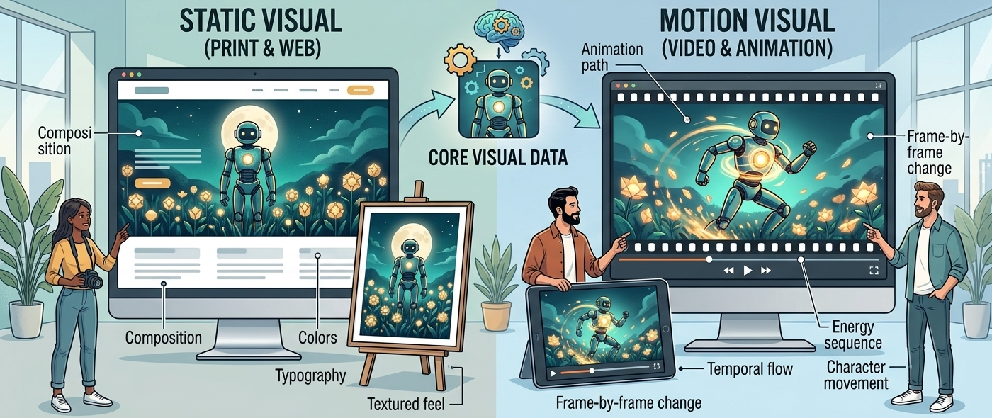
The core—idea, layout, hierarchy, that visual vibe—stays rock solid. What shifts? How people feel it at the moment.
In this post, I’ll walk you through our static-vs-motion mindset, what really flips when things start moving, and how we pick the winner for the job.
[Space for intro frames: static vs motion side-by-side]
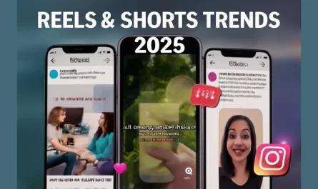
Why This Question Matters Now
These days, brand stuff fights for airtime in endless scrolls. Platforms hype motion like it’s the holy grail, but trust me, it’s not a slam dunk.
We’ve tested it all: Static banners sometimes absolutely crush video in those fast-scroll feeds where people barely pause. Gentle motion steals the show over even the punchiest statics on homepages where users actually linger. And over-the-top animations? They get totally ghosted—people swipe past faster than you can say “frame rate.”
The secret sauce isn’t motion—it’s where it lives and how people actually use it in that moment.
Everything Starts Static
We always nail the still version first. It’s our reality check.

This locks in the basics: layout that guides the eye naturally, hierarchy that screams what’s important, type that’s instantly readable, spacing that feels just right, and colors that hit the mood perfectly. If it doesn’t hit hard in one glance, no fancy animation will bail you out—trust me, we’ve tried.
Static isn’t “boring”—it’s smart. It delivers an instant “aha” moment that lands before they even realize they’ve stopped scrolling. It creates zero brain drain—no waiting, no processing multiple frames. And it works flawlessly without anyone waiting for the perfect loop timing or sound to kick in.
Fail the static test? Motion just papers over the cracks and makes the core weakness even more obvious over time.
[Space for static frame example]
When Motion Levels It Up
Motion only joins the party if it does something useful. It pulls your eye exactly where it needs to go with purpose-built paths. It unrolls complex info step-by-step so nothing gets lost in the noise. It creates a beat that sticks in your head long after they’ve scrolled past. And it makes the deal or call-to-action pop quicker than words alone ever could.
The visual DNA? Untouched. We’re just adding the dimension of time to unlock new possibilities.
It shines brightest when folks are doom-scrolling passively and need that subtle hook to break the trance. It works great when you’ve got layers of info that need to unpack without overwhelming. And it gives repeat visitors that fresh nudge they need to notice something they missed yesterday.
No “just for fun” wiggles or pointless sparkles. Motion clarifies. Hooks. Converts. Done.
Our Studio’s Two Motion Playbooks
1. From Static to Seamless Animation
We grab the client-approved static and breathe life into it. No starting from scratch, no risky reinterpretations.
This keeps it tight: You get pixel-for-pixel matches across every version so nothing feels “off.” The brand stays pure with no sneaky shifts in personality or vibe. And static and motion end up feeling like twins from the same womb, not distant relatives who showed up to the family reunion wearing different clothes.
It’s perfect for social ads that need to scale fast across platforms without losing their soul. It works great for in-app moments where consistency builds trust. You’ll love it for website chunks that need to feel connected. And it’s ideal for performance-driven banners where every impression counts.
Only the flow changes—timing that feels musical, smooth fades that guide without distracting, smart pops that emphasize without overwhelming.
[Space for approved frames screenshot]
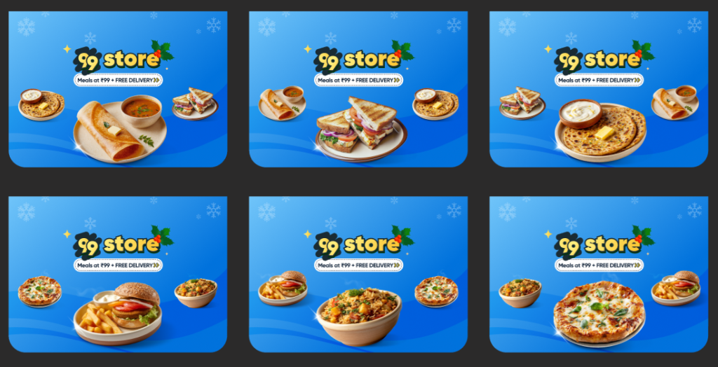
2. Lottie Frames: Minimal Stop-Motion Magic
This is our studio’s secret weapon. We craft custom Lotties for homepages, especially high-stakes gigs like Swiggy and Toing by Swiggy where first impressions = revenue.
They’re super stripped-back so they never compete with the content. They run as endless loops that feel alive without demanding attention. They capture those charming stop-motion vibes—choppy, hand-crafted, full of personality. And they’re intentionally never fully “done,” so they stay intriguing even after 50 visits.
How it works (with real meat):
Food shots stay simple and mouthwatering—no glossy overkill that kills appetite or feels fake. Offer badges get a cheeky bounce, a quick puff-up, or a heartbeat pulse that screams “limited time!” without yelling. Loops reset sneaky-like with clever overlaps, so even your 10th visit feels new and discovery-packed. And this setup kills animation fatigue completely, even for daily users hammering the app 5x a day.
Real-World Context: Swiggy & Toing Homepages
Swiggy App Homepage
🔗
Toing by Swiggy Homepage
🔗
On spots like these, static headers melt into the background blur of competing elements. Motion creates tiny bursts of “whoa”—that delight spark that makes users smile involuntarily. And offers land feeling urgent, buzzing with life, and easy to spot even in peripheral vision.
Our tests showed these loops snag eyes 2–3x faster than flats because they create movement in a sea of stillness. They stretch out how long people linger by turning passive glances into active curiosity. And they boost recall without overwhelming anyone—users remember the offer without feeling bombarded.
What Actually Changes (And Why Animation Wins)
Conceptually? Zero shift—idea, hierarchy, words, brand all locked tight.
But feeling it? Night and day. Static demands instant clarity—one look and you either get it or scroll away forever. There’s no mercy in feeds where you get 1.5 seconds max before you’re gone. It packs all the story into one frame for perfect comprehension in a blink—ideal for speed demons who never stop moving. And it delivers a one-time impact that hits hard once but then blends into the background as “banner blindness” inevitably kicks in on repeat visits. Static stays completely silent, relying purely on visual punch with no movement or sound to carry any emotional weight.
Motion flips all that by adding rhythm—like a heartbeat or your favorite song that pulls you in gently, builds tension, then delivers the punch exactly when you’re ready. It creates sequenced understanding that unfolds like a well-told story, revealing layers smoothly without ever overwhelming. Instead of one-time impact, it offers repeat discovery—loops tease new angles and micro-details every cycle, fighting banner blindness with fresh intrigue. And it’s inherently expressive, whispering (or shouting) emotion through purposeful moves that breathe real personality into what would otherwise be static concepts.
On homepages, motion doesn’t just show up—it keeps calling you back like a great song on repeat.
Our Lottie Process (Simple but Intentional)
We start by defining the loop’s soul through real conversations. We chat it out: Should the food drop in bouncy and fun, or smooth and sophisticated? How playful should the offer feel—winking emoji-level or subtle professional tease? This mood-setting conversation prevents generic animation.
Next, we design static frames with motion baked in from the start. We build in purposeful overlaps, breathing room for elements to shift, and parts that naturally beg to flex and move. The static version still slays completely on its own—no compromises.
Finally, we animate minimally but masterfully. We add quick stop-motion pops that feel hand-crafted. We layer in tiny exaggerations that delight without distracting. And we craft loops that never bore because they hide their repetition in clever visual tricks.
Static roots are deep. Motion makes it sing forever.
Example Lottie References
Toing Broke Hours Lottie
🔗
Swiggy 99 Store Lottie
🔗
Toing Weekend Offer Lottie
🔗
[Space for embedded previews or more examples]
Common Pitfalls We’ve Avoided
We never add motion just to flex because it gets boring faster than you can refresh the page. We don’t redesign from zero because that creates an inconsistent city where nothing feels connected. We avoid animating the important stuff like logos or key text since it kills clarity when people need it most. And we never slap feed-style animations on homepages—they’re just the wrong vibe for surfaces where people actually live.
Our winners? They feel natural, like they had to move that way. Effortless magic.
How Brands Should Think About It
Static and motion aren’t rivals fighting for budget. They’re teammates in one visual family working toward the same goal.
Static becomes your reliable anchor that holds the brand steady across every surface. Motion sparks the engagement that turns passive viewers into active customers. And Lotties create that homepage glue keeping high-frequency users coming back excited.
Design once with intention. Tweak smart for each surface. Rule everywhere with confidence.
Conclusion
Ditch “Static or motion?” Try: “What’s this visual for, and where does it live?”
Nail a killer static base that works everywhere, layer on smart motion (Lottie-style for homepages), and you’ve got scalable magic that performs.
Same visual. Totally different worlds. On purpose. Every time.
FAQs
Does motion always beat static?
Nah. Static owns quick peeks in feeds. Motion wins for deeper hangs where engagement matters.
Why not design separately?
Drift happens fast. One source = tight brand control across every asset.
When is motion a must?
Homepage loops, spots people revisit 10x a day, high-frequency surfaces.
AI’s role here?
Speeds up tweaks and iterations, but never replaces the creative spark.
Can one visual scale everywhere?
Yep, strong hierarchy is key. We’ve done it at Swiggy scale across 10+ formats.
Biggest motion mistake?
Wiggle without purpose. If it doesn’t clarify or hook—or skip it completely.